A real animal, reduced until only the structure is left.
Milo is named after a golden lion tamarin. These are twelve attempts to get that animal onto a pixel grid without turning it into a mascot: silhouette first, then reduction, then the test that matters — take the pixels away and see whether anything was ever designed.
Nothing on this page is locked. The wordmark Milo. remains the identity and stays valid on its own; the standalone symbol is still open (MILO_BRAND_SYSTEM_V1.md §6.4). One candidate is marked as a recommendation at the end because it wins on measurable grounds, not because the decision has been made. The decision is the founder's.
Milo was a golden lion tamarin. He had one leg. He was the fastest.
The founder knew him while serving as a docent at Zoo Atlanta. The meaning the brand takes from it is one sentence: circumstance should not define capability.
That is the whole story and it is enough. It is a fact about an animal, remembered by someone who watched him move. It is not a parable and it does not belong in a campaign. In this study it does one job: it decides what the mark is about. The mark is about speed, adaptation and forwardness. It is not about a missing limb, and the missing limb is not a visual device here — study 11 tests that question directly and the answer it returns is no. Full context in 38 Origin and docs/MILO_ORIGIN_V1_2.md.
Why the brand colour is already the right colour
Milo Vermilion #F04A24 was locked in V1 as a semantic: Milo is present, Milo is acting. A golden lion tamarin is golden-orange. The hex does not change and the semantics do not change — the system can now answer why orange with something other than taste. Signal Moss is unrelated to the animal and never appears in any of these studies, including on the branch in study 08. Moss belongs to Offline (28 Logo System 28.4).
Structure was taken from zoology, not from an impression of a monkey.
Two Smithsonian photographs under CC0 gave the proportions; the published literature gave the locomotion. Nothing was traced.
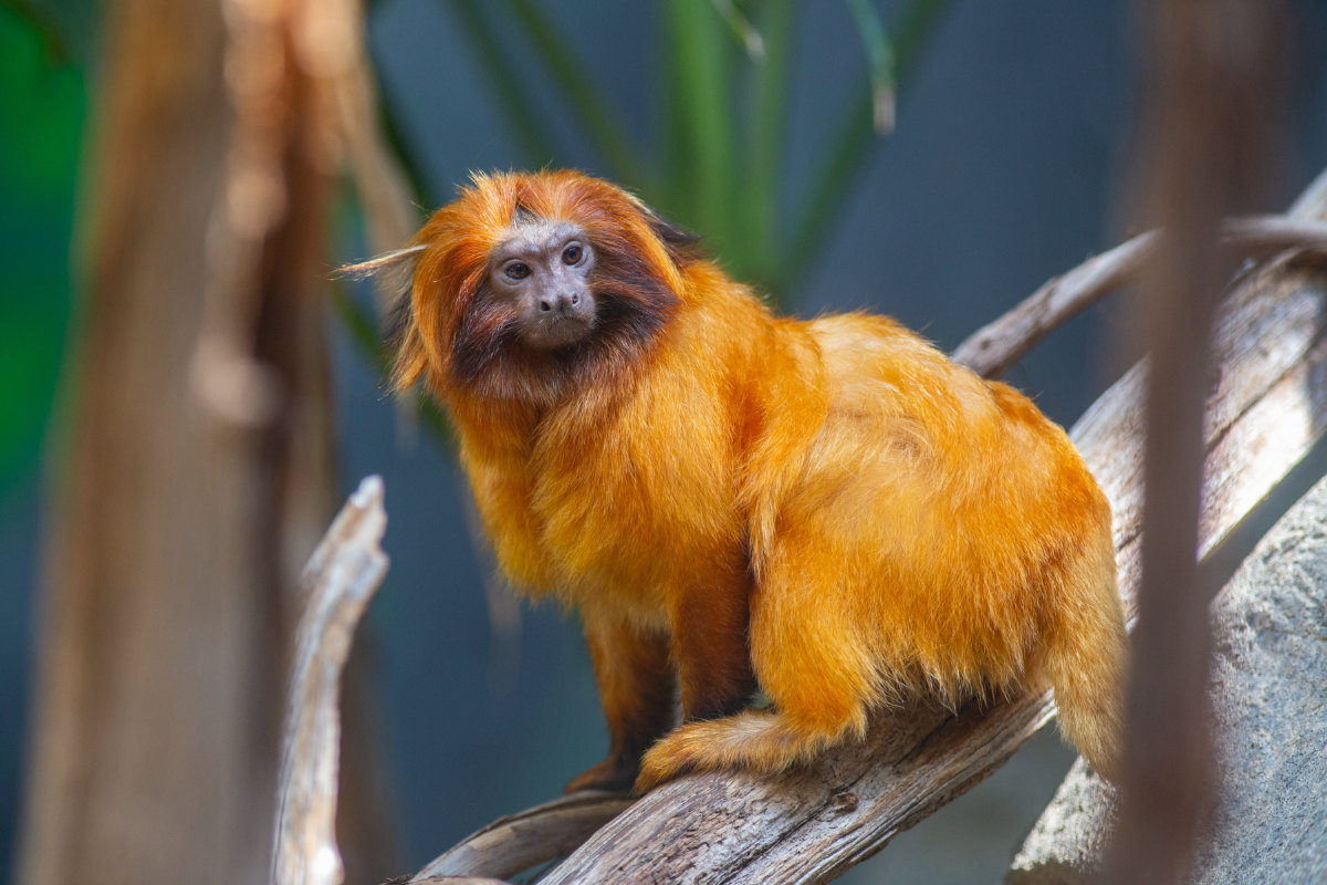
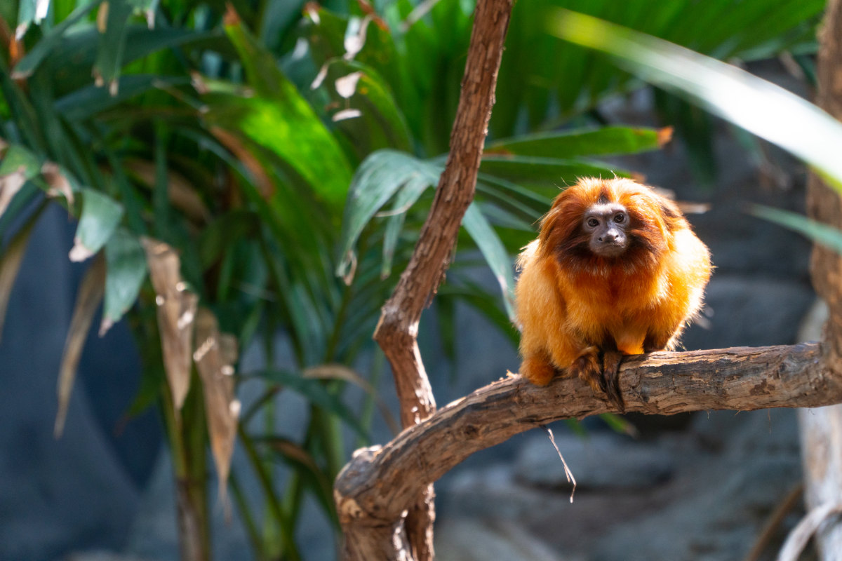
The frontal photograph is the one that decided the study. Seen head-on the whole animal is a single near-circular mass of fur, and the bare face sits inside it as a hole in the upper third. That is not a stylisation — it is the silhouette. It also means the mark the brand already has, a disc inside a ring, has the same topology as the animal it is named after.
The eight structural principles these studies are built from
| principle | measured or cited | what it does to the mark |
|---|---|---|
| One fur mass | the coat hides the articulation; the outline is a smooth ovoid about 1.4 : 1 | the body is one block, never a jointed figure |
| Face as a void | face diameter ≈ 0.40 × mane diameter, centre set 0.14 × diameter above the mane's centre | the face is a hole, and it is where the vermilion goes on a frontal mark |
| Mane thin over the brow, thick below the jaw | the mane covers crown, cheeks, throat, ears and shoulders | the ring around the void is deliberately uneven |
| Tail longer than the body | head-body 200–366 mm, tail 315–400 mm, non-prehensile, used for balance | the tail is the longest single element and it is a gesture, not an appendage |
| Long forelimbs | Leontopithecus has the highest humerus-to-femur ratios in the family | the front of the animal leads; the reach goes past the head |
| Horizontal leaper | prefers thin, flexible, terminal branches; quadrupedal walking and bounding, diagonal-sequence gait | the movement is forward along a line, not up a trunk |
| Claws, not nails | pointed claws (tegulae) on every digit except the hallux; elongated digits III and IV | the hand reads as reach and grip, never as a paw |
| Head carried low and forward | the crown sits barely above the shoulder line in the profile photograph | the head leads the mass instead of sitting on top of it |
SOURCES · Smithsonian's National Zoo and Conservation Biology Institute, Golden lion tamarin · Animal Diversity Web, Leontopithecus rosalia · New England Primate Conservancy, Golden Lion Tamarin · Nascimento et al., Vertical clinging and leaping induced evolutionary rate shifts in postcranial evolution of tamarins and marmosets, BMC Ecology and Evolution 2021 · Rosenberger and Stafford, Locomotion in captive Leontopithecus and Callimico, 1994. Full URLs in evidence/glt-logo-exploration.md.
Before a single pixel: is the shape any good?
Each study was drawn as a continuous silhouette — one fur mass, one void, stroked lines for tail and reach — and only then reduced. The test is the reverse: remove the pixel treatment and see whether a designed shape is still there.
What the silhouette test threw out
- The profile quadruped fails the test. A golden lion tamarin seen from the side, reduced, is a cat. The species' distinctive feature is not its profile — it is the mane with a face inside it. Studies 01, 07 and 11 all hit this, and only 07 escapes it, by making the maned head dominate the body.
- Pure gesture loses the animal. Studies 03 and 09 are good graphics — a comma and a diagonal swash — but with the pixels removed there is no tamarin left in either, only a loop on a stick. Both were dropped on the silhouette, not on the reduction.
- The frontal mass survives everything. One circular mass with an off-centre void is legible as a silhouette, as pixels, at 16 px, in one colour, and in motion. Every finalist is built on it.
- Silhouettes live in
assets/logo/glt/*-silhouette.svg, one for every study. They are geometry, not tracings.
Honest grids, where every cell is a decision.
12, 14, 16 and 20 cells square. At these sizes there is no room to describe anything — a cell is either load-bearing or it is noise.
The reduction is not a filter. Every study was drawn as a silhouette in a 48-unit box, machine-reduced onto its grid once to see the honest answer, and then re-drawn by hand cell by cell, because the machine answer is always slightly wrong in the places that matter: the void closes, the tail breaks into specks, the limb becomes a dotted diagonal.
| rule | value |
|---|---|
| Face void | 0.40–0.43 × mane width, its centre 0.14 × width above the mane's centre |
| Void enclosure | the void is closed on all four sides, or it stops being a void and becomes a notch |
| Connection | no element connects to the mark by a diagonal only — at 16 px a diagonal join breaks |
| Ink density | 44–232 cells; below about 45 the mark thins out, above about 60 % of the grid it closes up |
| One vermilion element | the leading edge on a mark in motion, the face on a frontal mark. Never Moss. |
| Files | shape-rendering="crispEdges", integer coordinates, viewBox = the grid |
SOURCE · tools/glt_geom.py (silhouettes + reduction) · tools/glt_grids.py (the hand grids)
Twelve different constructions, not twelve versions of one drawing.
Each is a different answer to the question of what a golden lion tamarin is when there is almost nothing left to draw with.
One fused mass in profile, head carried forward, the face a closed void high in the mane, a long forelimb reaching past it to a vermilion hand, the tail a rising hook behind.
The mane alone, its outline stepped in and out so the fur radiates, thin over the brow and thick as a bib below the jaw. The face is the void it frames.
The tail carries the mark: one sweeping descent, with the animal compressed to a maned head at the leading end of its own movement.
The figure resolves only at the leading edge. Behind it the same body is sampled at half and then a quarter of the grid — speed as a falling sample rate, not as a blur.
The frontal silhouette the photographs actually give: one near-circular mass, the void in its upper third, two feet notched into the base, the tail hanging out of it.
Perfectly radial: a ring, eight radiating arms, a centred void. The tamarin reads second and the disc-in-a-ring reads first.
The mane is quantised to 2 × 2 blocks and the body and limbs stay at 1 × 1. One mark at two resolutions: the dither threshold made structural instead of decorative.
The substrate is part of the mark. A thin terminal branch with visible ends, bowed under the weight, the grip in vermilion, the tail hanging clear of the line.
Tail, spine and reach reduced to a single three-cell stroke. The animal is not on a trajectory; the animal is the trajectory.
The bound compressed on a 12-grid until only direction survives: a thick chevron, a crown step on the leading arm, a tail flick off the rear, the apex in vermilion.
The same bound with three limbs, all extended, none stumped. Drawn to be judged, not to be kept — see 39.10.
Not drawn but thresholded: one frontal mass, solid where the diagonal field is below the threshold and Bayer-sampled where it is above. The only study where a function, not a hand, places the pixels.
Three finalists: a crown, a figure, a threshold.
One bust, one whole animal in motion, one mark made by the dither itself. They survived because each is legible as a silhouette, holds its void at small size and needs no explanation to look deliberate.
The mane as a radiating crown with the bare face as the void it frames. From study 02.
The whole animal in a forward crouch, mane coarse at 2 × 2 and body fine at 1 × 1, tail raised, reach in vermilion. From study 07.
The frontal mass, solid on one side of the threshold and dithering away on the other. From study 12.
Every test size, both grounds.
16, 24, 32 and 64 pixels, on cream and on carbon. A mark that mushes at 16 px does not get to be the mark.
Single colour, app icon, menu bar.
In one colour the face has to stay a knockout, which is what the -mono files are for. Tinting the two-colour file one colour fills the void and the animal disappears.
What the size tests actually returned
| finalist | smallest size that still reads | what fails below it |
|---|---|---|
| A · crown | 16 px | nothing yet. At 16 px the radiating edge flattens to a burr but the void survives as a single vermilion pixel block and the mark stays itself. It is the only one of the three that is a genuine favicon. |
| B · figure | 24 px | at 16 px the two pixel weights collapse into one, the tail thins to a hairline and the animal becomes a smudge with an orange dot. Usable as a presence, not as a mark. |
| C · threshold | 24 px | at 16 px the dither becomes noise rather than a threshold — the whole point of the mark is lost and it reads as a dirty blob. It wants 32 px and above. |
PROOFS · evidence/glt-size-tests/*.png, rendered by tools/glt_proofs.mjs at 3× and looked at, not inferred.
Four ways to arrive. All of them end quiet.
About 260 ms of movement and then nothing. Motion explains a change; it is never decoration, and the final state is always the still mark.
LEFT · THE CSS AND SVG IMPLEMENTATION, LIVE IN THIS PAGE · RIGHT · THE CAPTURED GIF, LOOPING · REPLAY RERUNS THE LEFT ONE

The mark writes itself left to right in 14 steps. Nothing moves once it has landed.
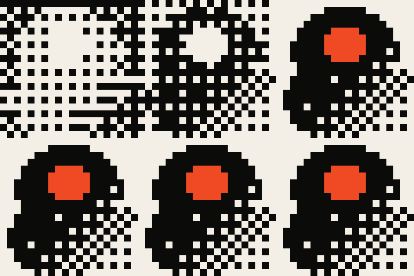
A continuous field is thresholded away until only the mark is left. This is the brand thesis in one gesture.
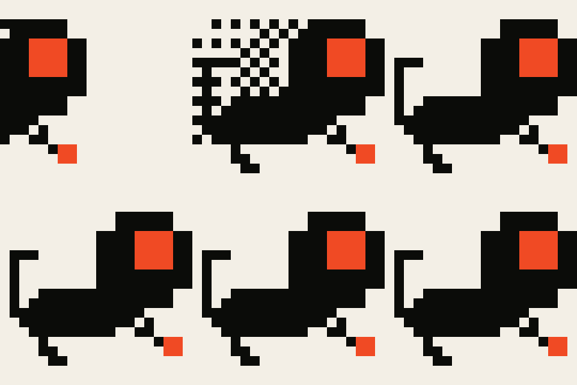
It arrives from behind with two sampled copies of itself. The samples fall away; the animal lands.

The structure resolves neutral. The vermilion lands last, on its own, because vermilion means Milo is present.
All twelve captures, and the rules
- Every study exists for every finalist:
assets/motion/glt-final-{a,b,c}-{assembly,dither,trail,vermilion}.gif, twelve files. - GIF, never MP4 — the page blocks cross-origin video, and this build's ffmpeg has no
libwebpencoder, so animated WebP is not available here. - 13 frames of movement at 20 ms, then a 600 ms hold on the still mark, looping. The movement itself is the target 260 ms.
prefers-reduced-motion: reducestops every animation on this page and shows the final state only.- Rendered by
tools/glt_motion.mjs, which follows the frame-capture and palette approach already intools/motion.mjs.
The wordmark does not need the symbol. The symbol has to earn its place beside it.
They are related by scale, spacing, colour and grid — never by distorting the typography. Milo. stays Instrument Serif at its own tracking, and the full stop stays vermilion.
The relationship rules these tests produced
- The rhyme is the vermilion. The mark's face and the wordmark's full stop are the same semantic — Milo is present — and they should be the same colour at the same weight. That was not designed in; it fell out of the test, and it is the strongest argument that these two belong together.
- Horizontal: the mark's height equals the wordmark's cap height. The gap is 0.4 × the mark's height.
- Stacked: the mark is centred over the wordmark at 1.45 × its cap height, with one third of the mark's height between them.
- Never scale the type to fit the mark, never letter-space Milo. to match its width, never set the wordmark in the mark's colour if the mark is vermilion.
- The wordmark must survive alone, because today it is the identity. The symbol must eventually survive alone, which is why 39.7 tests it with no type anywhere near it.
Nine rejections, and one of them matters more than the rest.
Study 11 asked whether the story could be told by the anatomy — three points of contact instead of four. It cannot, and it should not. At 16 px a viewer counts limbs before they read movement, so the mark stops being about speed and becomes about a missing leg; and a mark that has to be counted has already failed. The brand's own rule says it plainly: the missing leg is not a visual device (docs/MILO_ORIGIN_V1_2.md §3). The study is kept on the page because a rejected option that is not shown is not a decision, it is an omission.
| study | why it did not survive |
|---|---|
| 01 bound | Reduced, a tamarin in profile is a cat. The mane is present but the body out-argues it. Closest of the rejects. |
| 03 gesture | Fails the silhouette test: with the pixels removed it is a loop on a curved stick. Beautiful, not a tamarin. |
| 04 trail | The trail works — it is the basis of the motion study — but the lead figure is too small to carry the detail it needs. |
| 05 seated | Real presence, and the strongest near-miss. It reads as an owl or a bear cub before it reads as a tamarin, and the frontal void is better used by A. |
| 06 sunburst | Confident and legible at every size, and generic. A perfectly symmetric sunburst belongs to everyone; the lobed asymmetry in A is what makes it Milo's. |
| 08 branch | The compliant branch is a genuinely good idea and the animal on it is not good enough. Worth revisiting as an illustration device rather than a mark. |
| 09 leap arc | Same failure as 03: a strong graphic with no animal left in it. |
| 10 chevron | At 12 cells the void cannot exist, and without the void the mark reads as a bird. It answers its own question: the face is the first thing that must be protected. |
| 11 three point | Rejected on dignity, above. |
The mark is the whole argument, compressed.
Nature, art and human intent are continuous, material and complex. Computation discretises. Dither is not a texture in this system — it is the threshold where a continuous, living thing becomes a countable one, with the loss left visible. This study is that sentence performed on the animal the brand is named after: a real tamarin, reduced to a silhouette, snapped to a grid, resolved as pixels, and still recognisable at the far end. That is also the argument for keeping both sides present. A threshold only means anything when there is something on each side of it, which is why the engine renders from a credited original rather than shipping a baked picture, and why finalist C shows the threshold rather than the result.
A is recommended on technical grounds. The choice is not made.
Finalist A wins the measurable tests. It is the only candidate that holds at 16 px, the only one that works unmodified as a favicon and a menu-bar glyph, the only one whose void survives in a single colour, and it takes the same topology as the mark already in the system — a disc inside a ring — which means the origin explains the existing geometry instead of replacing it.
Its cost is honest too. Read cold it is a radiant disc before it is an animal; the tamarin has to be pointed out once. B is the only finalist that is unmistakably an animal in motion and it needs 24 px. C carries the most meaning and needs 32 px. Those are three different bets about what the mark is for, and that is a founder's call, not a test result.
This page is exploratory and stays exploratory until the founder says otherwise. The wordmark Milo. carries the identity in the meantime and remains valid on its own.
FILES assets/logo/glt/ · EVIDENCE evidence/glt-logo-exploration.md · PROOFS evidence/glt-size-tests/ · MOTION assets/motion/